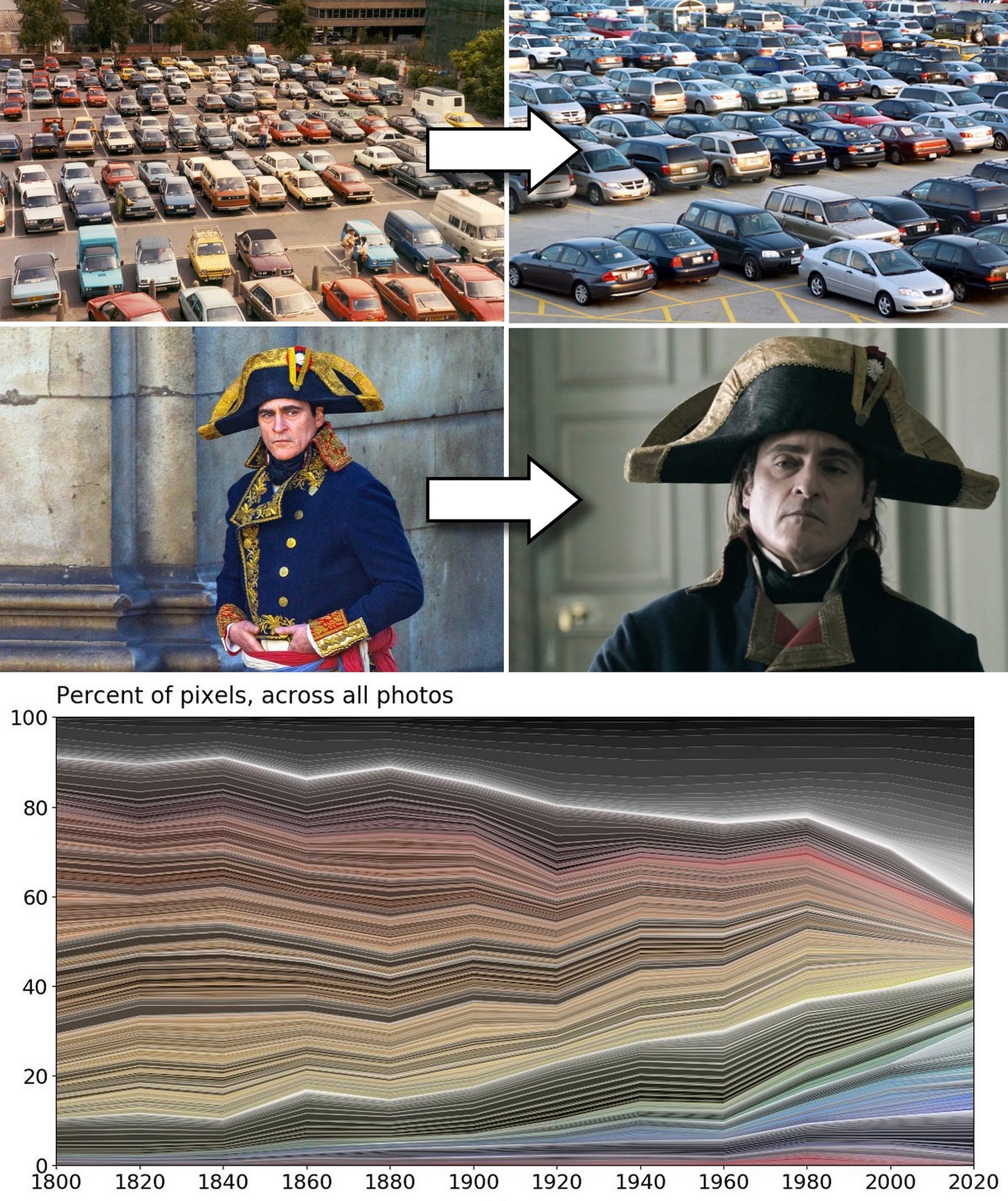
Walk around in the average parking lot, and you’ll find yourself in a sea of black, white, and silver vehicles. Watch Netflix at home or catch a film in the theaters, and you’ll get the same washed-out color grade on either screen. Glance at the logos of the world’s largest companies, and you’ll notice a shrinking palette.
It all points to one thing: color is vanishing from our world.
This isn’t just a hunch. Studies of everything from car paint to consumer objects show that we’re in the midst of a vast aesthetic shift. What used to be vibrant has become sterile. What used to pop out and catch our attention now fades into the background.
The question is — why?
The answer isn’t just about fashion or materials, but is rooted in a much older understanding of the relationship between color and truth.
Here’s why color is disappearing from our world, and what we can do to bring it back…
Reminder: you can support us and get tons of members-only content for a few dollars per month 👇
-
Full-length articles every Wednesday and Saturday
-
Members-only podcasts and exclusive interviews
-
The entire archive of great literature, art and philosophy breakdowns
Approximately 1% of our readers currently support us with a paid subscription. We are almost entirely reader-supported, so a paid upgrade helps our mission immensely. 🙏
The colors around us aren’t just changing. They’re disappearing.
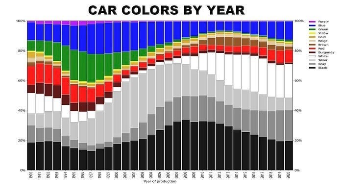
According to major auto paint suppliers, more than 80% of new cars are now grayscale. Black, white, gray, and silver dominate the roads. Reds, blues, and greens in auto production are increasingly rare.
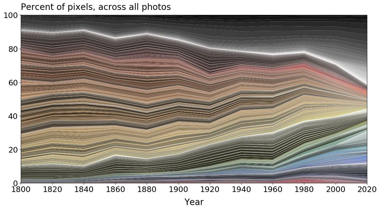
It’s not just cars — a study of over 7,000 objects in the UK’s Science Museum found that the colors of consumer goods have been steadily neutralized since 1800. Bright, saturated tones have been giving way to gray, beige, and taupe for centuries.
Graphic design has followed a similar trend. Streaming platforms, fashion brands, and e-commerce hubs are consistently rebranding in black-and-white. Most recently, HBO’s move to rename its service “Max” was accompanied by a logo redesign that stripped away its original blue — replacing it, of course, with stark white text on a black background.
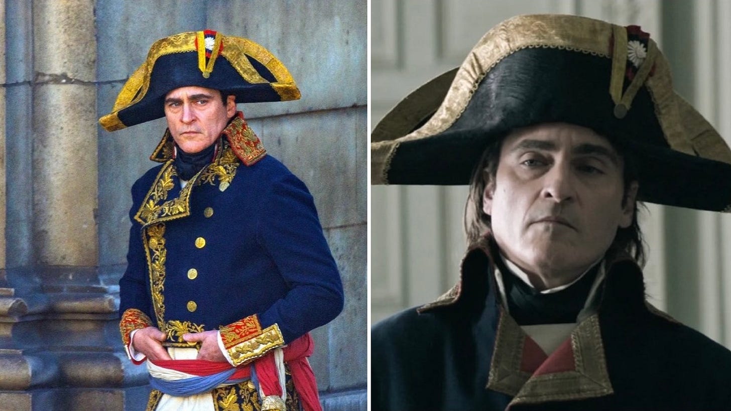
Even cinema has gone gray. Although Ridley Scott’s Napoleon was shot on vivid, richly colored sets, its final color-grade — like that of many historical dramas — washes out all the colors in a somber, blueish-gray tint. It’s a visual style that has become so ubiquitous that directors like Wes Anderson are often considered “unorthodox” for their use of vibrant color in film.
On the surface, there are some straightforward reasons for this. Industrial materials like steel and plastic, for example, are produced in neutral shades. Grayscale branding for logos is easier to reproduce and scale. Muted palettes are less likely to alienate customers.
But this isn’t the whole story. To fully understand why color is disappearing from our world, we have to go further back…
Color has always had a strange status in Western philosophy — and more often than not, that status is second-class.
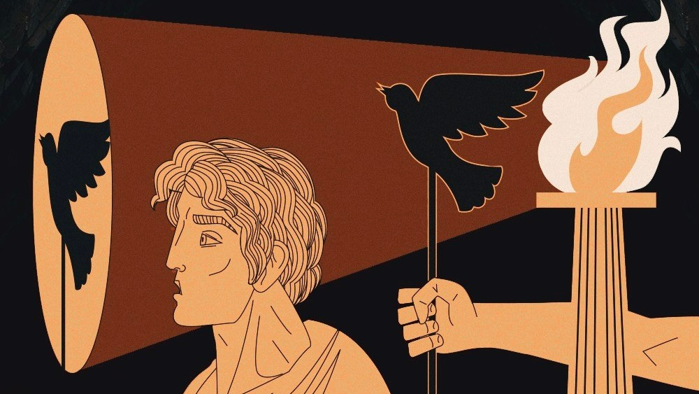
In Chromophobia, art theorist David Batchelor argues that the devaluation of color can be traced to the very birth of Western thought. From Plato onward, color was treated as a distraction: sensory noise that got in the way of rational understanding.
Plato described the world of appearances as a deceptive “prison-house,” i.e., a realm of illusion where truth could only be grasped by looking beyond the senses. Color, tied directly to sensation, was thus something to overcome — not to embrace.
Aristotle echoed the sentiment. In Poetics, he argued that the power of artwork lay in its structure, not its palette:
“A random distribution of the most attractive colors would never yield as much pleasure as a definite image without color.”
For Aristotle, it’s form that holds meaning — not hue.
This view persisted through the Enlightenment, with German philosopher Immanuel Kant arguing that while color may add charm to art, it has no bearing on true aesthetic judgment. In his view, color neither touches reason nor elevates the mind.
The underlying theory in all of these cases is that while color is sensory, unstable, and chaotic, form is rational, stable, and pure. Once you see this bias, you begin to notice how deeply it has shaped the modern world — and how it helps explain our current retreat into colorlessness.
The modernist philosophy developed in the early 20th century helped push Western culture’s underlying suspicion of color to its extreme. For architects like Adolf Loos, color was a kind of primitive indulgence — the enemy of clarity and seriousness.
In his 1910 lecture Ornament and Crime, Loos celebrated a future without decoration or color, where aesthetic purity came from form alone. “We have gone beyon


30 Comments
techpineapple
"Color has always had a strange status in Western philosophy — and more often than not, that status is second-class."
I wonder if one big change is a shift from a more working class family focus to an upper class influencer focus. Maybe this is just because was a kid, but It does feel to me like as a kid in the 80's and 90's and probably earlier, that the middle class was essentially the aspiration, and everything was geared towards the middle class family, think happy meals and McDonald's play place. Now, everything is geared for the wealthy social media influencer's, it's not a meal, it's an experience.
crazygringo
It's not "losing" color.
At periods when technology resulted in new color possibilities, people went overboard with color. Make all the things colorful!! Think of the technicolor sixties. And we can go back in history and see the same thing with new clothing pigments, new paint pigments.
But when everything is colorful, nothing stands out. Everything being colorful is as monotonous as everything being, well, monotone.
Modern taste is more about more neutral-colored foundations with color accents. Don't paint a whole room green — have a gorgeous green plant that stands out all the more against its neutral background. Don't paint a whole wall orange — have a beautiful orange-hued piece of art on the wall. It's just more tasteful to use color as one element, along with size, shape, texture, and so forth. Making it the main element in everything is just overdoing it. It's bad design.
I don't want constant "riotous color", as the article puts it, in my home, or my workplace, or while I'm driving. It's visually exhausting.
fguerraz
I would argue that the main reason is because everything is about money, and the shorter marketability of everything. Colors are polarising, and affect the unsold inventory and perceived resale value.
Why manufacture objects in 10 different colours if you know the green one is going to be a tough sell? Why buy a blue car if you think you’re going to sell it back after 2 years and struggle to do so?
You don’t want things you don’t intend to keep to have personally, period.
graypegg
I won't pretend to be an expert on the cultural aspects of this, but the most compelling historical proof they have of their thesis is that chart showing the measurement of hue over a whole bunch of objects in museums, by era.
Is it possible this is a bit of… https://xkcd.com/1138/ ? The Y axis is 100% because you can only look at the objects we have, but that doesn't reflect the fact we don't have 100% of objects from 1800. We only have the objects we cared enough about to protect.
So… in someways, (in no way proof of anything) this could show the opposite? We produce a lot of junky monochrome things that get thrown away fast, and things that we care enough to protect for generations tend to be coloured. We're sort of seeing the half-life of things by colour in that chart.
banqjls
Colour is a form of bling and bling is tasteless.
WD-42
Gen Z is rejecting this "millennial bland" aesthetic of turning all spaces into an Apple store. Just one reason I appreciate and look forward to the coming generation. Take a look at some of their trends in art, music, fashion, graphic design… plenty of color to be found.
itsanaccount
[flagged]
lurk2
I’ve certainly noticed this in film and interior design (most AirBnBs will have a familiar grayscale palette), but the opposite trend has occurred in software. Windows 2000 was far less colorful than Windows 10, which in turn had a more saturated palette than Vista and Windows 7.
galkk
They take Napoleon, as recent film with bleak colors.
I will take latest matrix. The movie was awful, of course, but I was in awe of its bright, vivid, wonderful color work. If only plot was better.
VoodooJuJu
[dead]
zuInnp
For me, it is very apparent in movies nowadays.
I watched the Lord of the Rings over Christmas, and I was stunned by how colorful the movie is. Even in the darkest scenes in Mordor, it felt more colorful than movies of today.
Today, it looks like everything is shot in log and then someone does not add the saturation back. But I am also guilty of this .. when I got my new camera, my graded clips also looked very flat, but I like(d) that look because of all the movies and youtube videos looking like this.
intellectronica
I miss the 90s and the wild, loud colours the landscape of the future was supposed to be painted in. Now everything is off-white or grey.
kelseyfrog
Color is the last vestige of ornamentation[1].
Modern design didn’t kill color. It put it on probation. Stripped of aesthetic authority, color now has to justify its existence or get cut. No more freedom to wander or express, it shows up for assigned tasks only: branding, signage, error states, traffic lights.
In the cult of "form follows function," color met the axe. We no longer trust it to create, only to comply. Expressiveness? No. Just signal. Never art. A century after Ornament and Crime, we put color on a PIP. Beauty must be functionalized.
1. https://www2.gwu.edu/~art/Temporary_SL/177/pdfs/Loos.pdf
pxoe
Is this another one of those "old good new bad" "culture" grifters that subtly lean right? Looking at their other profile elsewhere, sure seems so. Yikes.
areoform
What's interesting to me is that these writers (and I've followed this person's twitter page) almost always decry the "loss" of color or how Disney sanitizes folklore https://x.com/the_culturist_/status/1905688869078532237 and he tends to attribute it to a vague, philosophical reason that's a restatement of the problem.
He also tends to allude a lot to the "decay of the west." He almost never explicitly says it, but he gestures at it a lot;
" The loss of the great train stations was the failure to realize that monuments are what build nations. / Penn Station was a train station, but it was also an ode to the railroad and the civilizational energy that built it." – https://x.com/the_culturist_/status/1900609951216603265
"America built some of the world's greatest architecture — then demolished it." – https://x.com/the_culturist_/status/1884599666517352601
"Western culture faced obliteration several times" – https://x.com/the_culturist_/status/1882519624870502690
Except the truth is simple; things have became minimalistic and less colorful now because that sells. Disney became Disney and sanitized Grimm's stories because it sells.
Those buildings were torn down because the US gradually began funding public works and then receded from generously funding them, leading to a reorientation to what the market wanted – which was more parking garages, or an arena like Madison Square Garden.
At its core, the US is a hyper-consumer focused economy where every major corporate decision relating to content is (usually) focus grouped to death and beyond. Taste still plays a role, but if taste doesn't sell, American corporations tend to adapt pretty quickly and sell slop instead. And vice versa.
If tomorrow, people started loving colorful cars, then every car manufacturer out there will start selling more colorful cars.
There is no deeper philosophy here. Or, overarching design. It's an atomized consumer culture that's oriented towards ever greater consumption.
So yeah, the world "lost" color because Apple became the world's largest corporation. And it sells.
JKCalhoun
Wow, so much to rage about from the article.
I am a huge fan of color and go out of my way to buy bright colored cars, phones, etc. (Not like I had any viable options for my MacBook Pro though).
Resale value, it hides dirt well are some of the sadder excuses I hear for buying gray and "silver" cars (wouldn't be cool if they really were silver, not "metallic gray"). Meanwhile you spend your entire time owning the car and driving around like a brooding storm cloud.
Color grading might be the most evil thing to descend on film making. It's to the point of distraction now. Like it draws attention to itself. (Watching "Mickey 17" in a theater and a scene comes on that screams "color graded!" and then it's become all I can see. Kind of like the nausea-inducing, shaky "hand held camera" thing that was so predominate some decades ago. Good riddance to that.
Oh well, I guess all I can do is to keep voting with my shopping preferences.
RiverCrochet
Random thoughts.
Movies: Movies descended from live theater, which was not realistic by definition, so things had to be attention-getting in order to draw people into the reality of the story, including use of color. Older movies, and older colorful movies, were closer to that tradition and therefore kept some of that impressionism, which faded as "realism" became the thing to do in movies.
Cars: Searching online I found this chart: https://www.reddit.com/media?url=https%3A%2F%2Fexternal-prev… – and … it seems that people stopped buying green and purple cars and are buying black, white, and silver instead, with red/burgundy varying somewhat over time. A paragraph here – https://www.colorwithleo.com/why-isnt-green-a-popular-car-co… – provides something insightful:
"Historical Perceptions of Green Cars
For many decades, green was seen as an unappealing and sometimes odd choice for vehicle color. Back in the 1950s and 1960s, green was associated with military and industrial vehicles, which didn’t make it an attractive option for personal cars. The green paints used on older vehicles also tended to fade and discolor over time, giving the color a reputation for looking worn and dated. This perception lingered for many years, and made consumers wary of choosing green for their own cars."
But not sure how true that is and not sure it would apply to the 90's–the starting time that the chart covers. I really don't remember anyone in the 90's having a green car at all, to be honest.
Logos: Company logos have been getting simpler for a long time, almost to the point where it's pretty much it's the brand name in a specific font in most cases. I recall reading about an "anti-branding" trend in logo design – https://shapesofidentity.substack.com/p/the-rise-of-anti-bra… – and that's because of lowered trust in brands overall – which is true. Brands aren't worth a damn if they can be bought and sold and the company beneath them change without notice.
deadbabe
Colors aren’t cool. You know what’s cool? Clean perfect lines, rich texture and materials. Imagine a cube of polished concrete stone, with a wood plank sanded and stained to a warm perfection, basking in the glow of a square window at a perfect 45 degree angle. Beautiful, it can move you to tears.
This worship of color is how you end up with Gen Z who paint over beautiful bare wood furniture and cabinets. Enraging.
akomtu
> The underlying theory in all of these cases is that while color is sensory, unstable, and chaotic, form is rational, stable, and pure.
And pure reason is inhuman.
Color represents emotions, form represents reason. Since emotions is a big part of human nature, the loss of color means the western society has been sliding into a depression, and the west is depressed because it's falling under the influence of the origin of this colorless stereometric brutalism.
dansmyers
Pair with this complementary piece by W. David Marx:
https://culture.ghost.io/cultural-stasis-produces-fewer-chee…
He writes about incentives since the 1990s that have pushed artists to shy away from making bold aesthetic choices that might seem dated a few years later.
The result is more stability and a longer shelf-life for culture, but less experimentation and fewer ways for new styles to break out.
roughly
One interesting thread here is the long shadow of Greek and later Roman statuary and architecture on Western European self image – the marble statues, columns, and architecture of the Roman empire were taken as the origin story for Western culture – "we were an empire built on philosophers and artists, and look at the (gleaming white) purity of their works."
It turns out, of course, that all those gleaming white statues were vibrantly colored back when their creators were around, and the Greeks and Romans were not cultures of conformity or austerity – quite the opposite, but the seeds of the philosophy sank in hard, and here we are.
(Ironically, both stoicism and Christian asceticism were responses to that Roman excess, but they've somehow been merged with the white marble to produce a "purity" aesthetic to be lionized whenever someone gets the mildly uncomfortable notion that their neighbor is not exactly like them.)
WillAdams
Interestingly, there was a specific printing technology for expanding the palette of colour printing, Hexachrome:
https://en.wikipedia.org/wiki/Hexachrome
Tried several times to use it in projects, but the customer always balked at the additional plate charges, even when they _loved_ the added vibrancy and colour range.
The only printer I know of who was actually successful using it to make money was in London — took on spot colour jobs from other printers when the spot colour was inside the expanded Hexachrome gamut, allowing for a faster turn-around (jobs on the same stock were ganged up) and no charge for washing down a press to change out the ink.
megmogandog
The loss of color is concerning, but something I find interesting is the image the author chooses to illustrate Loos' quote, "We have achieved plain, undecorated simplicity." I would argue the building pictured falls short of this goal in important ways. A lot of contemporary architecture lacks the modernist commitment to flat planes, pure volumes, etc. and adds lazy and useless decorative/textural elements. The building pictured would look better if it was less adorned! (But even better with some color)
The ugliness of the contemporary world isn't a result of modernism, but rather neoliberal indifference to beauty.
ctrlp
Adolf Loos designed some incredibly sumptuous interiors. They aren't lacking in color. Methinks he's being used unjustly as a scapegoat to grind some axe. To me, this essay is an example of "slop."
ieie3366
It is not.
If you feel so, it is a massive red flag that your brain is in a depressive state.
Source: fixed my mental demons and now the world is suddenly full of color and life, as if I was a child again
dudinax
It's the Seattlefication of the world.
rlue
Am I the only one who thought the lead photo should have included Gen 1 iMac vs. latest lineup? Even the 2021 anodized aluminum version is comparatively muted!
skrebbel
My wife convinced me that we should buy a dark gray car cause it would be less obviously dirty. I deeply regret not trying harder to convince her back, so we'd get a bright red or yellow one instead. It's super hard to find the car back on a parking lot and who cares when it's dirty? Bright colors are nice. I'm now trying to compensate by only buying colorful clothing going forward.
liampulles
I live in South Africa, and when I traveled to the Netherlands on holiday last year, I was quite taken aback at how muted everyone's clothing was.
It is definitely not like that here – everything from our flag down is full of color.
guyzero
There's a really interesting book about this exact topic: https://reaktionbooks.co.uk/work/chromophobia
I agree with the book's thesis – there's an impulse to associate colour with "the oriental, the feminine, the infantile, the vulgar, or the pathological" in contemporary western society. We've somehow managed to other color itself.
"The central argument of Chromophobia is that a chromophobic impulse – a fear of corruption or contamination through colour – lurks within much Western cultural and intellectual thought. This is apparent in the many and varied attempts to purge colour, either by making it the property of some ‘foreign body’ – the oriental, the feminine, the infantile, the vulgar, or the pathological – or by relegating it to the realm of the superficial, the supplementary, the inessential, or the cosmetic.
Chromophobia has been a cultural phenomenon since ancient Greek times; this book is concerned with forms of resistance to it. Writers have tended to look no further than the end of the nineteenth century. David Batchelor seeks to go beyond the limits of earlier studies, analysing the motivations behind chromophobia and considering the work of writers and artists who have been prepared to look at colour as a positive value. Exploring a wide range of imagery including Melville’s ‘great white whale’, Huxley’s reflections on mescaline, and Le Corbusier’s ‘Journey to the East’, Batchelor also discusses the use of colour in Pop, Minimal, and more recent art."