


Welcome to the first article in a series on Demographics. Over the course of this series, we want to give you the most thought-provoking and actionable demographics charts and insights – straight to your inbox.
We will start off by introducing the Problem Index and pointing at some of the most challenging demographics in the world. We would love to hear your feedback and input and thus we have made this article free-to-read. The rest of the series will be part of our Watch Series and require Premium membership – but if you sign up now, you get a 14 day free trial to our Premium Plan and will receive the next installments in the series without paying a dollar for it. Click here read more!
Now – let’s get to it!
Media focus on demography comes and goes on such a whim – an ‘overpopulation’ headline here, a ‘record migration’ report there – that filtering out the signal from the noise becomes unreasonably difficult. In a field so oversaturated with ‘hot takes’, a level-headed approach to demographics between the worlds of academia and standard media is surprisingly absent. Today, introducing our new Demographic Watch series, we hope to go some way to rationalise what demographic trends and forecasts are actually suggesting for the future in an approachable way. We invite you to join us on this journey.
The Trend Isn’t Your Friend
A sensible starting point for our framework begins with the problem of ageing populations. A standard way to think about a maturing population is the median age – literally the age midpoint of a population:
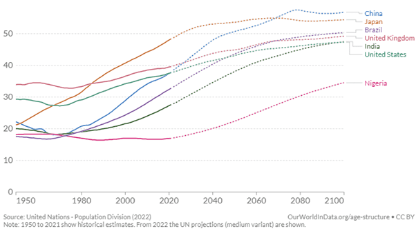
Source: Our World In Data / United Nations – CC Licence https://creativecommons.org/licenses/by/3.0/igo/
In itself – interesting! But this only describes an ageing population, and not the actual problem of an ageing population. The problem rather refers to the growing dependency of an elderly, non-working population, on its younger working cohort. As demographic age profiles of a country worsen, the strain that the growing group of economically consuming, but now non-contributing elderly population places on state finances grows if the size of its working population is unable to ‘keep up’.
Enter the Old Age Dependency Ratio: the ratio of economically inactive elderly people to the working age population. Calling this a loaded proxy understates things – at what point do we define an elderly population to be inactive, and how do we think about the working age population? Retirement ages clearly differ by country, the proportion of younger age workers differs greatly from place to place, groups of people dip in and out of the workforce even into later lives – the list goes on. Alas, we must abstract at some point, and in our case the sensible approach suggests taking as conservative an estimate as we can (and which the data permits). We therefore consider the economically inactive population beginning at 65, and the working age population between 16 and 64. Filtering for countries with 5 million or more people, what does the current state of the ageing problem look like?
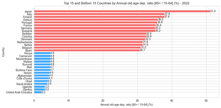
Source: Steno Research
Well, it looks almost exclusively European, with the single exception – and a notable one at that – of Japan. We hear frequently of the ageing problem not only as a future constraint on Japanese society, but one that it is already having to deal with. The Middle East and Africa unsurprisingly scans on the other end of this spectrum, with younger societies shifting the balance. How do things look in 10 years time from now?
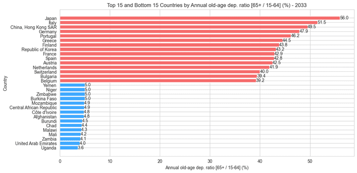
Source: Steno Research
Put simply, the world begins to catch-up. But it is Hong Kong and the Republic of Korea whose meteoric increases in dependency stand out. Korea, staggeringly, moves from 26th place to 8th overall with an increase in its Old Age Dependency Ratio from 24.7% to 43.2%. Shown another way, in grey are the top 15 countries as of 2022. In red are Hong Kong and Korea.
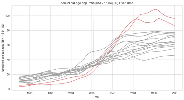
Source: Steno Research
Plugging the Gap
But this is only half of the issue – the question is, what are societies actually doing to deal with the ageing problem? The hiring of migrant labour to plug supply gaps has proven instrumental in managing the issue admittedly early in its evolution. Scanning through the Net Migration Rates of destination countries – i.e. the number of migrants entering a country per 1,000 people of its population – again point to some familiar trends.
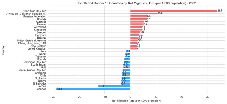
Source: Steno Research
We disregard the likes of Syria and Russia due to a volatility factor in the migration series, leaving a top 15 dominated by developed Europe and Asia. A mixture of South American, African and Middle Eastern names make up the bottom 15. This brings two questions to light:
Question 1: We know that Continental Europe and Sou