


I am pleased to here introduce a new satellite image product that i have been working on for a few months. Development of this has been co-financed by Geofabrik. They are going to offer tile services for web maps based on this image in combination with the Green Marble.
Background
Most of the readers of this blog will be familiar with the Green Marble – my global satellite image product offering the highest quality rendering of the whole earth surface available at a resolution of 250m. The Green Marble is produced with a pixel statistics approach, that means an analysis of all observations available is done independently for every pixel of the image to estimate the surface color at this point. This kind of technique is very popular because of its principal simplicity and because processing can be implemented in a very efficient fashion.
But this method has two main disadvantages:
- It requires a significant amount of data to actually get to a point where the final product is in visual quality equal to or better than an individual good quality image. How much depends on the algorithm used and its convergence characteristics and obviously this will differ a lot between different parts of the planet. For the Green Marble version 3 for example about 1PB of raw data was processed – which means more than 100kB of data per pixel.
- It does not scale well with increasing spatial resolution. I discussed this matter in more depth already back in 2018. This has multiple underlying reasons, the one that is most straight away to understand is that the higher the spatial resolution is you are looking at the more volatile the content of an image becomes. This mean the higher in terms of spatial resolution you go the less you have – on average – a long term stable state of the Earth surface your pixel statistics can converge to.
Long story short: Pixel statistics work very well at a resolution of around 250m if you have a large data basis to work with. They work poorly at much higher resolutions, even if you have a lot of data (which you typically don’t – but that is a different issue). This has not prevented various companies over the last 5-10 years to invest substantial resources in naively trying pixel statistics approaches on Landsat and Sentinel-2 data – with the expected mediocre results.
The alternative to pixel statistics for aggregating satellite imagery into a homogeneous larger area visualization is using classical mosaicing techniques where individual images are essentially put together in the form of a patchwork or mosaic. If you want a concise definition: You have a classical mosaicing techniques when the color at any point in the image is in most cases (a) primarily derived from a single source image and (b) the surrounding pixels are primarily derived from the same image. This is evidently not the case for a pixel statistics process where the processing of a pixel is not correlated to that of its neighbor.
Classical mosaicing techniques are the dominant method for aggregating very high resolution satellite and aerial imagery and for high quality images based on Landsat and Sentinel-2 data. The problem here is that achieving good quality with this approach requires fairly complex processing techniques and there are certain key steps that are notoriously difficult to automatize because the quality of the results depends a lot on competent human judgement.
Hence most satellite image based visualizations using classical mosaicing techniques either are relatively poor quality (high cloud incidences, poor consistency in colors across the seams between images) or are based on fairly old data because updates are costly.
I myself have been producing images using classical mosaicing techniques for nearly 20 years now (an early discussion of this can be found on this blog in 2013) and both improved and streamlined the methods i use over the years. But also for me hand work was so far always a key component in production of these images and as a result in many cases updates are very costly to do. Therefore i had been looking for some time at strategies to eliminate the remaining manual processing steps in the production of my higher resolution mosaics without sacrificing too much in terms of quality. With the help from Geofabrik i was now able to practically implement and evaluate some of these ideas and here i am going to present and discuss the results.
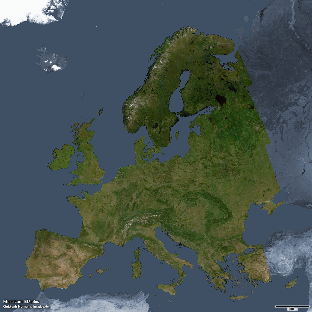
The Musaicum EU-plus – click for larger version
The image
At low resolution the image looks very similar to the Green Marble – which is not astonishing since it is assembled with the same aim – to depict the local vegetation maximum and snow minimum. If you look closely you can see the appearance is not quite as uniform as the Green Marble – with some inhomogenities that are clearly non-natural. Part of this is due to the low volume of data used (put simply: Not ever