

- 18 min read
Thanks to some recent changes in browsers, it’s now well worth setting width and height attributes on your images to prevent layout shifts and improve the experience of your site visitors.
Web performance advocates have often advised to add dimensions to your images for best performance to allow the page to be laid out with the appropriate space for the image, before the image itself has been downloaded. This avoids a layout shift as the image is downloaded — something Chrome has recently started measuring in the new Cumulative Layout Shift metric.
Well, a dirty, little, secret — not that well-known outside the hard-core web performance advocates — is that, until recently, this actually didn’t make a difference in a lot of cases, as we’ll see below. However, adding width and height attributes to your
Recommended Reading
The CSS contain property gives you a way to explain your layout to the browser, so performance optimizations can be made. However, it does come with some side effects in terms of your layout. Read a related article →
More after jump! Continue reading below ↓
Why Adding Width And Height Were Good Advice
Take for example this simple page:
Your title
Introductory paragraph.

Lorem ipsum dolor sit amet, consectetur adipiscing elit…
This might render in two stages, first as the HTML is downloaded, and then second once the image is downloaded. With the above code, this would cause the main content to jump down after the image is downloaded and the space needed to display it can be calculated:
Layout shifts are very disrupting to the user, especially if you have already started reading the article and suddenly you are thrown off by a jolt of movement, and you have to find your place again. This also puts extra work on the browser to recalculate the page layout as each image arrives across the internet. On a complex page with a lot of images this can place a considerable load on the device at a time when it’s probably got a lot of better things to deal with!
The traditional way to avoid this was to provide width and height attributes in the
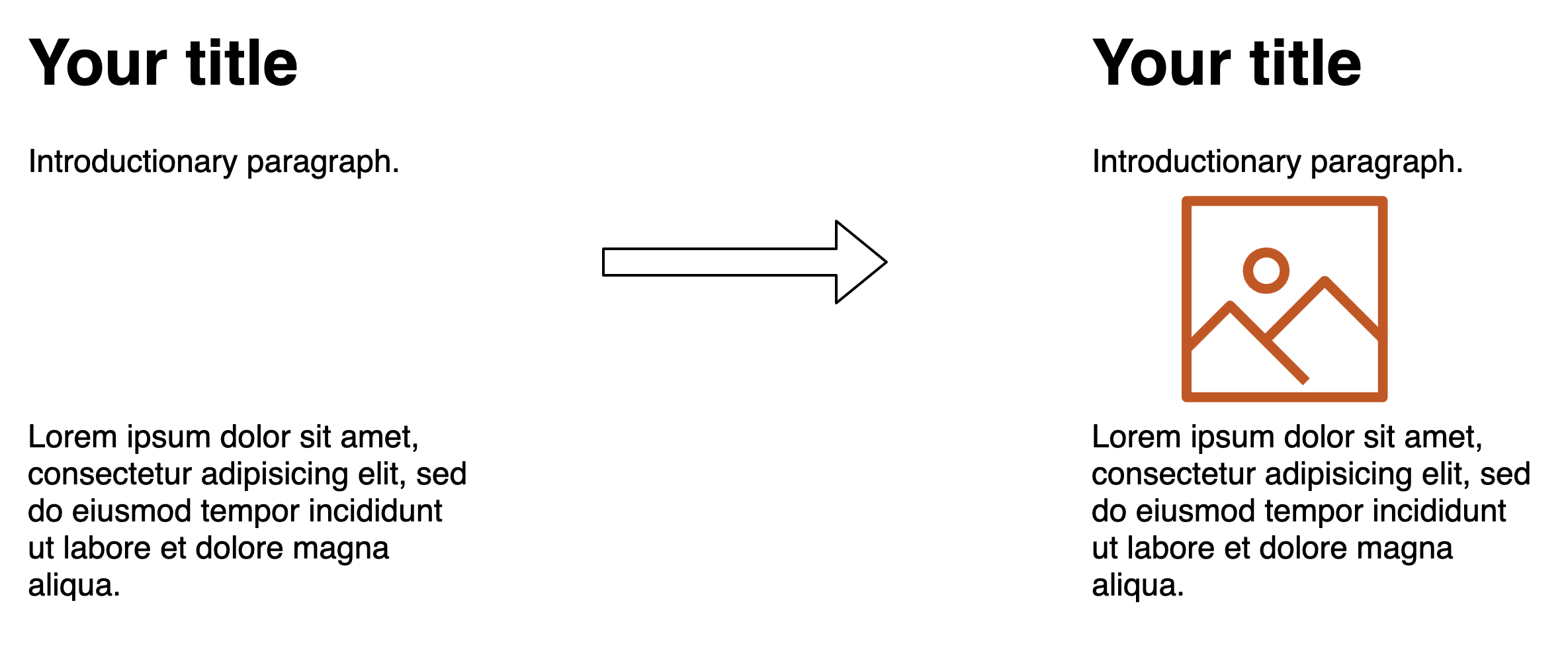
Your title
Introductory paragraph.

Lorem ipsum dolor sit amet, consectetur…
Then the render happens like below, where the appropriate amount of space is set aside for the image when it arrives, and there is no jarring shift of the text as the image is downloaded:
Even ignoring the annoying impact to the user in content jumping around (which you shouldn’t!), the impact on the CPU can also be quite substantial. The below screenshot shows the performance calculations performed by Chrome on a site I work on which has a gallery of about 100 images. The left-hand side shows the calculations when width and height are provided, and on the right when they are not.
As you can see, the impact is considerable — especially on lower-end devices and slow network speed, where images are coming in separately. This increases load time by a noticeable amount.
How CSS Interacts With Element Widths And Heights
Widths and heights on an image can cause issues when you try to alter them using CSS. For example, if you want to limit your images to a certain width you might use the following CSS:
img {
  max-width: 100%;
}
This will override the width of the image and constrain it when necessary, but if you have explicitly set the height on the image tag, then we are not overriding that (only the width) and you will end up with a stretched or squashed image, as we have no longer maintained the aspect ratio of the image:
This is actually very easily fixed by adding a height: auto line to the CSS so the height attribute from the HTML is overridden too:
img {
  max-width: 100%;
  height: auto;
}
However, I find it still catches people by surprise and sometimes leads to them not specifying image dimensions in the HTML instead. With no image dimensions, you can get away with just specifying max-width: 200px in the CSS without having to specify height: auto and the browser will automatically figure out the height itself — once it has the image.
So, once we add the dimensions and that the height: auto trick, we get the best of both worlds, right? No layout shifts, but also the ability to resize images using CSS? Well until very recently you might have been surprised to find out the answer was in fact: no (I was — hence why I decided to write this article).
For example, take the code below:
Your title
Introductory paragraph.

Lorem ipsum dolor sit amet, consectetur…
This would have resulted in this load:
height: auto is used in CSS. (Large preview)
Wait, what’s going on here? We’re back to the first problem. I thought I said that by specifying the image dimensions in the HTML you could avoid this layout shift problem? Well, this is where it gets interesting and will lead on to the main point of this article.
The problem is that, unless you were giving explicit width and height CSS values to your images — and who wants to limit themselves like that in a responsive world where you want the image to expand or shrink to fill up the available space — then CSS will need the dimensions from the image file itself to figure out the auto part of the dimensions. It ignored any width and height attributes set in the HTML.
The implication of all this is that specifying width and height attributes on images often wasn’t actually that useful in a lot of cases. Yes, when an image is being shown at full size, without any CSS changing any dimensions, it is useful to resolve the layout shifting problem. However, when you use CSS like below to ensure images do not overflow their available space, then you run into problems as soon as the available width becomes smaller than the actual image size.
img {
  max-width: 100%;
  height: auto;
}
This affects any page where we constrain the image size in a responsive manner — i.e. small screen mobile devices. These are likely to be the very users suffering with network constraints and limited processing power that will suffer most from layout shifts! Of course, we ideally should be delivering appropriately sized images for the screen size, but you cannot cover every device size, so often images will need some resizing by the browser, particularly on mobile.
Many websites may not bother to specify widths and heights on their