


This post is written by Kaiser, not Andrew.
Harvard Magazine printed the following chart that confirms a trend in undergraduate majors that we all know about: students are favoring STEM majors at the expense of humanities.
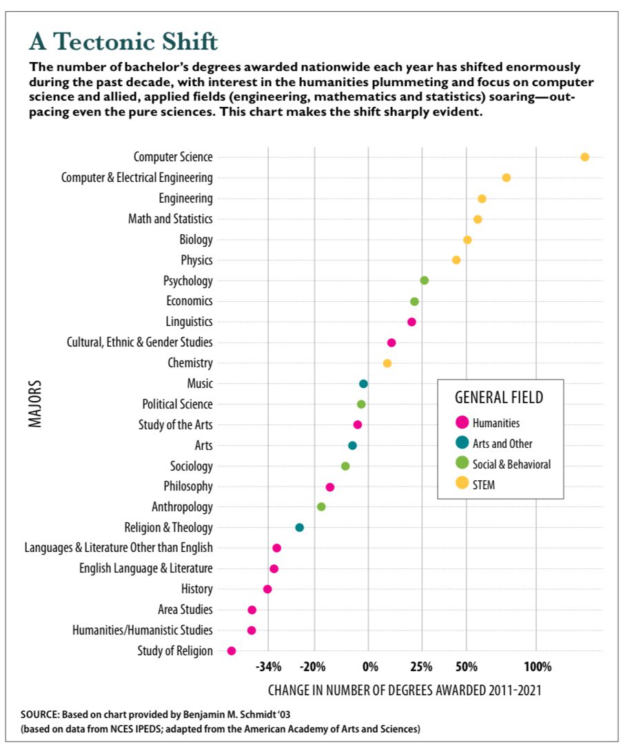
I like the chart. The dot plot is great for showing this dataset. They placed the long text horizontally. The use of color is crucial, allowing us to visually separate the STEM majors from the humanities majors.
Then, the axis announced itself.
I was baffled, then disgusted.
Here is a magnified view of the axis:
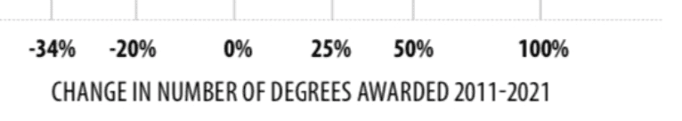
Notice the following features of this transformed scale:
- It can’t be a log scale because many of the growth values are negative.
- The interval for 0%-25% is longer than for 25%-50%. The interval for 0%-50% is also longer than for 50%-100%. On the positive side, the larger values ar